How to create a Pulse Loading animation in Jetpack Compose
Learn to use simple animations in jetpack compose

Animation and Custom Views always remains a headache for me but with the savior named Jetpack Compose it is a lot easier to create animation and custom UI components
Let me show you a demo of what we gonna make today
//Demo
Looking Nice? The code is much nicer..!!
Ok, now enough talking let me give you the recipe... Let's start with the first ingredient
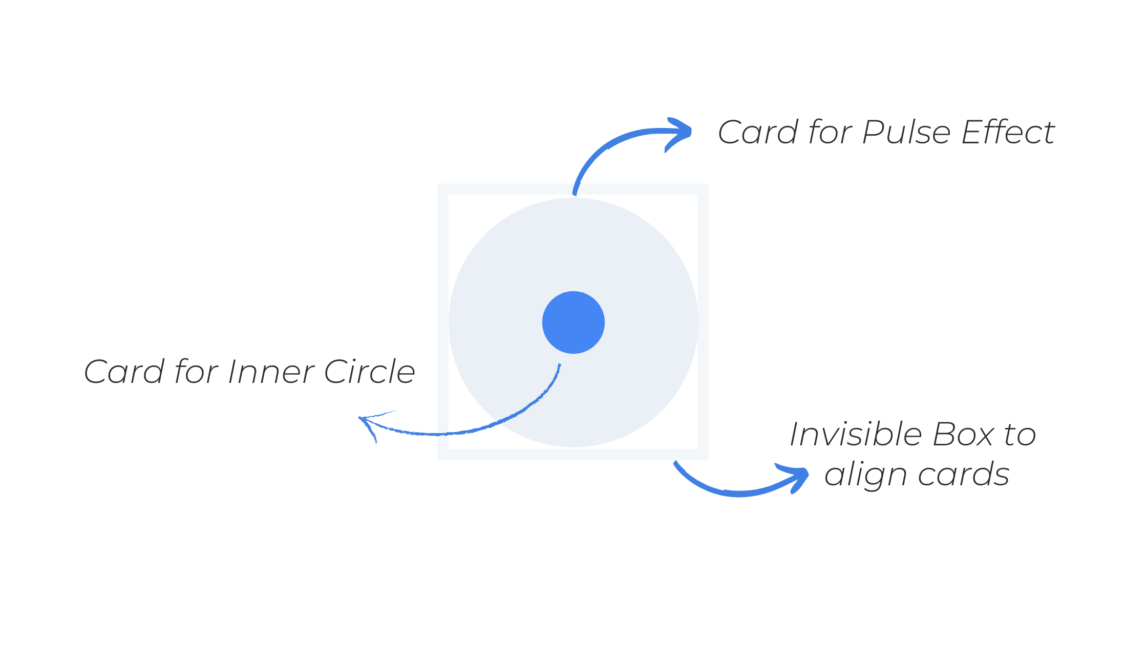
1. Cards
As you can see we have two circles here first in the middle and the second one for pulse effect. They both are Cards with a Circle Shape wrap in a Box container to align with each other.
Box(contentAlignment = Alignment.Center,modifier = Modifier.fillMaxSize()) {
//Card for Pulse Effect
        Card(
            shape = CircleShape,
            modifier = Modifier.size(size.dp).align(Alignment.Center).alpha(alpha),
            backgroundColor = pulseColor,
            elevation = 0.dp
        ) {}
//Card for the inner circle
        Card(modifier = Modifier.size(minPulseSize.dp).align(Alignment.Center),
            shape = CircleShape,
            backgroundColor = centreColor){}
    }
Now you might notice some variables here like size & alpha in the Card for Pulse Effect they are the properties we need to animate to create a pulse. and this takes us to the next ingredient
2. Infinite Transition
Now, this thing is what makes compose so great with animations. In Infinite Transition, the animations start running as soon as Composables enter the composition and do not stop unless they are removed. We can create an instance of InfiniteTransition with rememberInfiniteTransition.
val infiniteTransition = rememberInfiniteTransition()
With this, we can perform three types of animations
- animateColor
- animatedFloat
- animatedValue
For our recipe we need animatedFloat.
As I mentioned earlier we got two properties to animates - size & alpha
Now to animate size as float we just need to specify starting and end float value and some animate specs like duration, easing, and the repeat mode for infinite transitions.
val size by infiniteTransition.animateFloat(
        initialValue = minPulseSize,
        targetValue = maxPulseSize,
        animationSpec = infiniteRepeatable(
            animation = tween(durationMillis, easing = LinearEasing),
            repeatMode = RepeatMode.Restart
        )
    )
you can play around with these values and find the best effects for yourself.
And the same we need to do for alpha
val alpha by infiniteTransition.animateFloat(
        initialValue = 1f,
        targetValue = 0f,
        animationSpec = infiniteRepeatable(
            animation = tween(durationMillis, easing = LinearEasing),
            repeatMode = RepeatMode.Restart
        )
    )
Note: To sync both animations make sure to keep the durationMillis value the same.
Now, let's put it all together and start cooking.
@Composable
fun PulseLoading(
    durationMillis:Int = 1000,
    maxPulseSize:Float = 300f,
    minPulseSize:Float = 50f,
    pulseColor:Color = Color(234,240,246),
    centreColor:Color =  Color(66,133,244)
){
    val infiniteTransition = rememberInfiniteTransition()
    val size by infiniteTransition.animateFloat(
        initialValue = minPulseSize,
        targetValue = maxPulseSize,
        animationSpec = infiniteRepeatable(
            animation = tween(durationMillis, easing = LinearEasing),
            repeatMode = RepeatMode.Restart
        )
    )
    val alpha by infiniteTransition.animateFloat(
        initialValue = 1f,
        targetValue = 0f,
        animationSpec = infiniteRepeatable(
            animation = tween(durationMillis, easing = LinearEasing),
            repeatMode = RepeatMode.Restart
        )
    )
    Box(contentAlignment = Alignment.Center,modifier = Modifier.fillMaxSize()) {
        Card(
            shape = CircleShape,
            modifier = Modifier.size(size.dp).align(Alignment.Center).alpha(alpha),
            backgroundColor = pulseColor,
            elevation = 0.dp
        ) {}
        Card(modifier = Modifier
            .size(minPulseSize.dp)
            .align(Alignment.Center),
            shape = CircleShape,
            backgroundColor = centreColor){}
    }
}
and that's really it. 💟
Even if you don't understand something Let me show you how easy it is to use with the customization you want. First, copy and paste the final composable function in your project and then you can call it from anywhere.
@Composable
    fun EasyDemo() {
        //Simple with Default Values
       PulseLoading()

        //Still Simple with customization
       PulseLoading(
            durationMillis = 900,
            minPulseSize = 20f,
            maxPulseSize = 100f,
            pulseColor = Color.Red,
            centreColor = Color.Black
        )
    }
let's meet on Instagram @coding.ms . I daily upload useful Tips, News, Interview Questions, and Code Snippets about android development.
🔖 Make sure to save this blog for later reads..!

