Emoji Slider in Jetpack Compose using Canvas API
Learn to use Canvas API to create custom UI elements and managing states in Jetpack Compose

Hello Devs👋🏻, Jetpack Compose is truly amazing when it comes to custom UI's. Today let me show you how you can build an Emoji Slider as the one Instagram has. and if by any chance you haven't seen it yet let me give you a quick demo.
DEMO
looking nice..? Let's build it!
Before that Let's look at the things we gonna learn in this article-
How to use
Canvas APIin Jetpack Compose.How to manage
Statesin Jetpack Compose.How to create
Good Stuff Easily.
Ohk So, First we need to draw the UI, and then we will add the sliding functionality.
Drawing the Emoji Slider 🎨 -
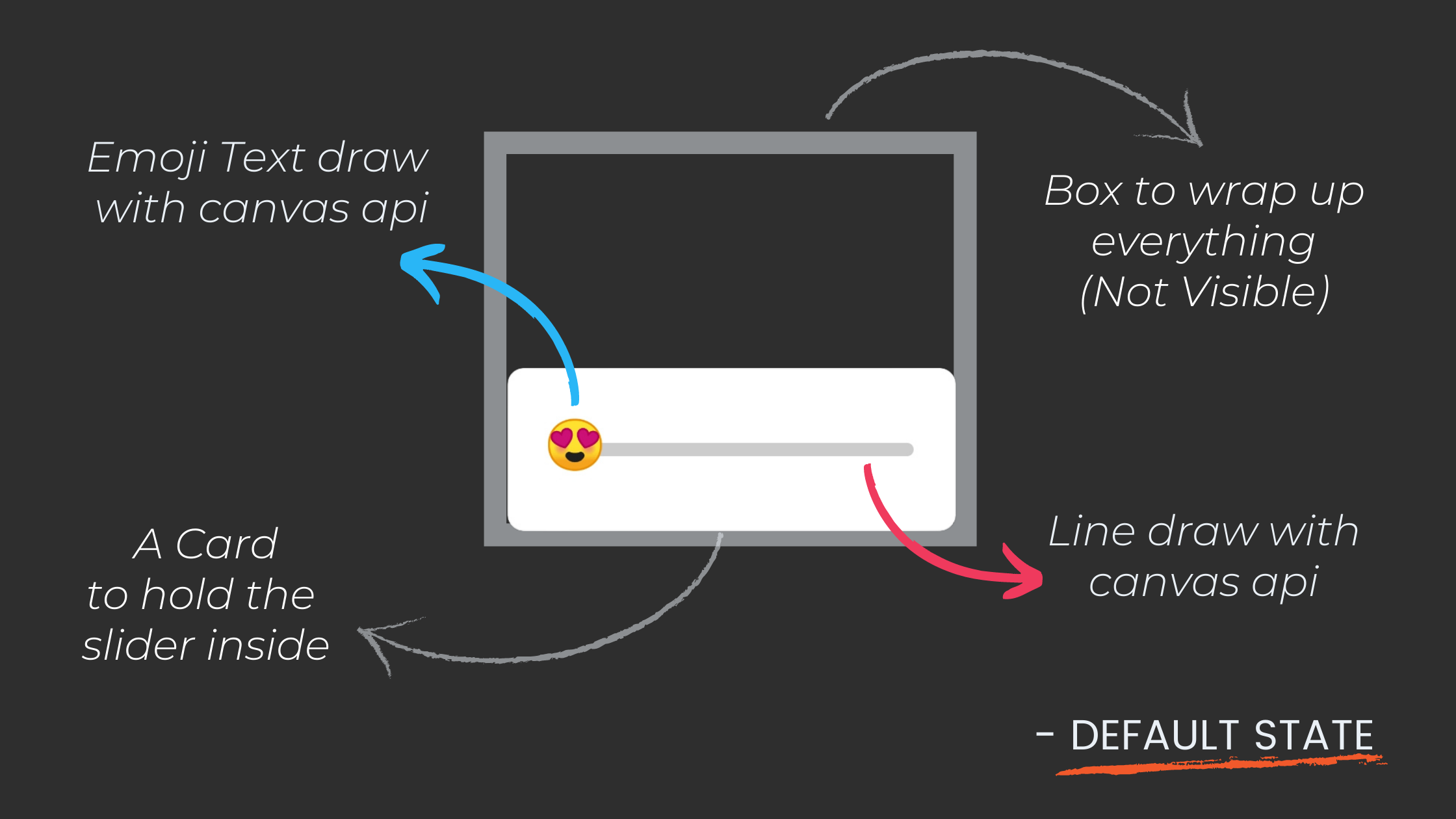
Let's Draw it one by one:
- Card
Card( shape = RoundedCornerShape(8.dp), backgroundColor = Color.White, modifier = Modifier .height(height) .width(width) .align(Alignment.Center) ) { // slider code } - Canvas - To draw Lines and Emoji.
Card(...){
     Canvas(
              modifier = Modifier
                  .fillMaxSize()
                  .padding(24.dp)
          ) {
                val canvasWidth = size.width
                val canvasHeight = size.height
                offsetX = offsetX.coerceIn(0f, canvasWidth) // declared above all this
                // Drawing Scope
      }
}
Here, fun T.coerceIn( minimumValue: T?, maximumValue: T? ): T
Ensures that this value lies in the specified range minimum-value...maximum-value.
OffsetX is a variable to hold the horizontal position(x-coordinate) of our Emoji
and while sliding we don't want our emoji to slide out of our canvas so we need to keep it in a range
and in our case, it is from 0( starting point ) to canvas-width.
- Line
Canvas(...){
             //Gray Line
              drawLine(
                  start = Offset(x = 0f, y = canvasHeight / 2),
                  end = Offset(x = canvasWidth, y = canvasHeight / 2),
                  color = Color.LightGray,
                  strokeWidth = progressWidth,
                  cap = StrokeCap.Round  // make line end points round
              )
 }
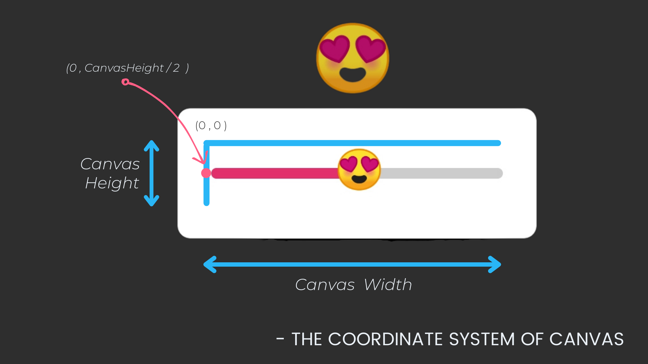
So, Our line starts from ( 0 , canvasHeight / 2) and ends on (canvasWidth, canvasHeight / 2)
We also need to draw one more line to show the progress of our emoji on Slide
in that, we will make the X-coordinate a variable (offsetX) which will change when emoji slides and update the UI.
Canvas(...){
               //Gray Line
                drawLine(...)

               //progress Line
                drawLine(
                    start = Offset(x = 0f, y = canvasHeight / 2),
                    end = Offset(x = offsetX, y = canvasHeight / 2),
                    color = progressColor,
                    strokeWidth = progressWidth,
                    cap = StrokeCap.Round
                )
}
Here, offsetX is a mutable state variable that will change on sliding the emoji and recompose the composable.
- Text(with Emoji Unicode)
Emojis are actually just strings. So, we need to draw the text with the special emoji Unicode string. but sadly compose canvas didn't provide a direct method to draw text we need to draw it with native canvas and that's how we do it -
Canvas(...){
               //Gray Line
                drawLine(...)

               //progress Line
                drawLine(...)

               //Emoji as Text
                drawIntoCanvas { canvas ->
                    canvas.nativeCanvas.drawText(
                        emoji, // Unicode Emoji String
                        offsetX - 26f,  // due to difference in coordinate system of compose canvas and native canvas
                        (canvasHeight / 2) + 16f,
                        Paint().asFrameworkPaint().apply {
                            textSize = emojiSize
                        }
                    )
                }
}
Now, you might b wondering How I am gonna get those Unicode emoji strings? Well, I got your back.
You can star this repo and contribute your Unicode strings here too.
ok! but still, we need to draw that enlarge emoji too. we will do it while adding that sliding functionality.
- Box - to wrap up all
Let's wrap up everything in a box.
Box(modifier = modifier) {
        Card(...) {
            Canvas(...) {
                val canvasWidth = size.width
                val canvasHeight = size.height
                offsetX = offsetX.coerceIn(0f, canvasWidth)

                //Gray Line
                drawLine(...)

                //progress Line
                drawLine(...)

                //Emoji as Text
                drawIntoCanvas { canvas ->
                    canvas.nativeCanvas.drawText(...)
                }
            }
        }
    }
and we are done with drawing. Let's start implementing sliding functionality.
Make things Slide
Now, First thing there are some variables that we have used before but I haven't said where to declare them because of all the state things we need to manage. So let's do it now.
@Composable
fun EmojiSlider(...){
    var isPressed by remember { mutableStateOf(false) }
    var offsetX by remember { mutableStateOf(10f) }
    var progress by remember { mutableStateOf(0f) }

    Box(...) {...}
}
"remember { mutableStateOf(value) }"is used to create a mutable state and our composable will be subscribed to that state variable that means when the value changes, everything that uses this value in that composable will be redrawn with the new value.
isPressed- used to check if the Emoji in the slider is dragging or not.offsetX- used to know the X coordinate of our emoji.progress- used to know the value of progress in the range of 0f to 100f.
Now, Let's look at the On Slide State.
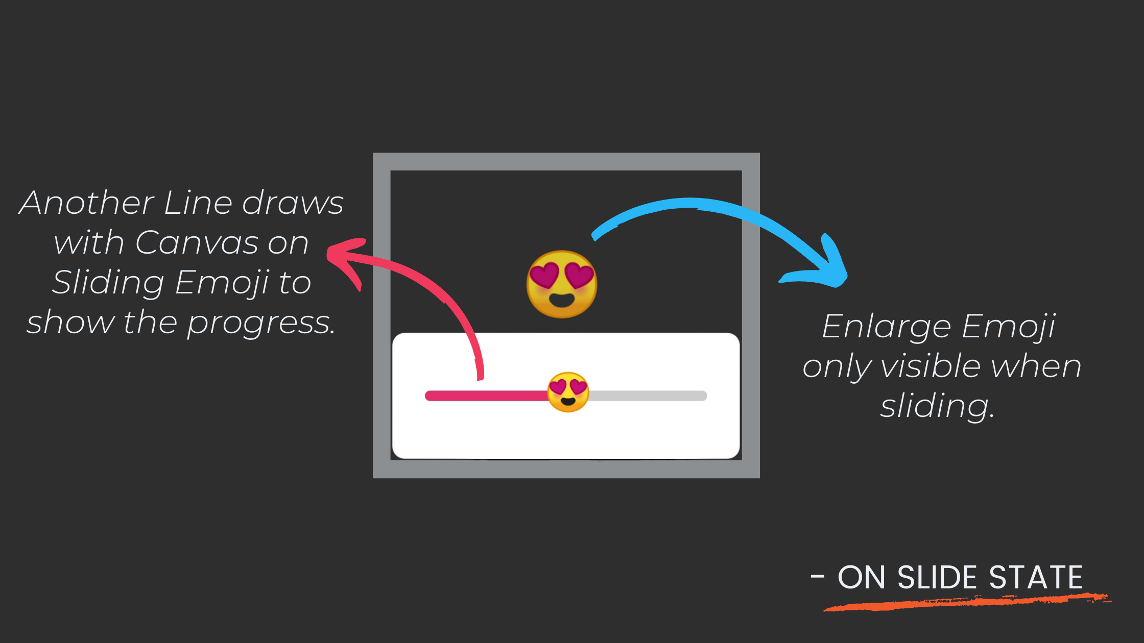
first, let's make our slider draggable. In other to do that we need to make our card draggable not the emoji because the card has more area to detect the drag gestures.
Card( ...
            modifier = Modifier
                .height(height)
                .width(width)
                .align(Alignment.Center)
                .draggable(
                    orientation = Orientation.Horizontal,
                    state = rememberDraggableState { delta ->
                        offsetX += delta
                    },
                    onDragStopped = { isPressed = false },
                    onDragStarted = { isPressed = true }
                )
        ) {
Here, orientation make sure to only detect the horizontal drags because we only need that.
and as the offsetX or isPressed value changes, recomposition happens.
On change of isPressed, we need to show or hide the enlarged Emoji.
Box() {
        Card(...) {...}

        if (isPressed) {
            Text(text = emoji,
                fontSize = progress.coerceIn(20f, 80f).sp,
                modifier = Modifier
                    .align(Alignment.CenterStart)
                    .offset {
                        IntOffset(offsetX.toInt(), -200)
                    })
        }
    }
Now, Here we just showing a Text composable with emoji Unicode string.
and to make It large/small with the slide we need to change the font size and I used coerceIn here because the value should be in the range of 20f to 80f(why? because I liked it this way. You can play around with these values) and I give our emoji a -200 y offset to move it little upward.
You can try with different values and find the right one for you.
and we are done building our emoji slider. 🎉
Let's put it all together.
@Composable
fun EmojiSlider(
    modifier: Modifier = Modifier,
    width: Dp = 220.dp,
    height: Dp = 80.dp,
    progressColor: Color = Color(0xFFE1306C),
    emoji: String = Emoji.heart,
    emojiSize: Float = 66f,
    progressWidth: Float = 18f,
    onSlide: (Float) -> Unit
) {
    var isPressed by remember { mutableStateOf(false) }
    var offsetX by remember { mutableStateOf(10f) }
    var progress by remember { mutableStateOf(0f) }
    Box(modifier = modifier) {
        Card(
            shape = RoundedCornerShape(8.dp),
            backgroundColor = Color.White,
            modifier = Modifier
                .height(height)
                .width(width)
                .align(Alignment.Center)
                .draggable(
                    orientation = Orientation.Horizontal,
                    state = rememberDraggableState { delta ->
                        offsetX += delta
                    },
                    onDragStopped = { isPressed = false },
                    onDragStarted = { isPressed = true }
                )
        ) {
            Canvas(
                modifier = Modifier
                    .fillMaxSize()
                    .padding(24.dp)
            ) {
                val canvasWidth = size.width
                val canvasHeight = size.height
                offsetX = offsetX.coerceIn(0f, canvasWidth)
                progress = (offsetX / canvasWidth) * 100
                onSlide(progress)

                //Gray Line
                drawLine(
                    start = Offset(x = 0f, y = canvasHeight / 2),
                    end = Offset(x = canvasWidth, y = canvasHeight / 2),
                    color = Color.LightGray,
                    strokeWidth = progressWidth,
                    cap = StrokeCap.Round
                )
                //progress Line
                drawLine(
                    start = Offset(x = 0f, y = canvasHeight / 2),
                    end = Offset(x = offsetX, y = canvasHeight / 2),
                    color = progressColor,
                    strokeWidth = progressWidth,
                    cap = StrokeCap.Round
                )
                //Emoji as Text
                drawIntoCanvas { canvas ->
                    canvas.nativeCanvas.drawText(
                        emoji,
                        offsetX - 26f, // due to diff in coordinate system
                        (canvasHeight / 2) + 16f,
                        Paint().asFrameworkPaint().apply {
                            textSize = emojiSize
                        }
                    )
                }
            }
        }

        if (isPressed) {
            Text(text = emoji,
                fontSize = progress.coerceIn(20f, 80f).sp,
                modifier = Modifier
                    .align(Alignment.CenterStart)
                    .offset {
                        IntOffset(offsetX.toInt(), -200)
                    })
        }
    }
}
I made this composable reusable by extracting all the values and used them as parameters. So, Even if you don't understand everything you can still use it in your project. Let me show you how...
  @Composable
    fun EmojiSliderDemo() {
        Box{
            EmojiSlider(
                emoji = Emoji.loveFace, // from the repo I share earlier
                modifier = Modifier.align(Alignment.Center),
            ){ progress ->
                Log.d("onProgressChange:",progress.toString())
            }
        }
    }
Have any queries? or wanna stay updated with the latest android trends? Follow me on Instagram @coding.ms

